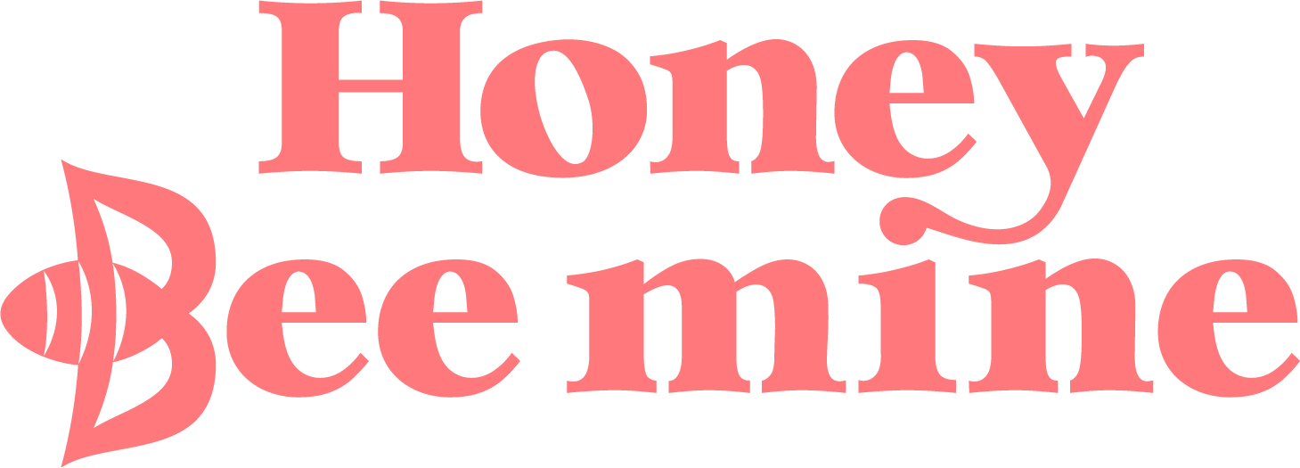
Designing A Wedding Brand: Sweet Like Honey


What if your stationery didn’t just notify your guests, but invited them into a whole world?
That’s the power of a wedding brand. It’s not about loud logos or gimmicky coordination. It’s about setting a tone that quietly lingers through every detail. A palette. A motif. A typeface. A feeling. And when it’s done right, everything belongs.
Let me show you exactly how that can look, through one of my distinct collections: Sweet Like Honey.


the vision
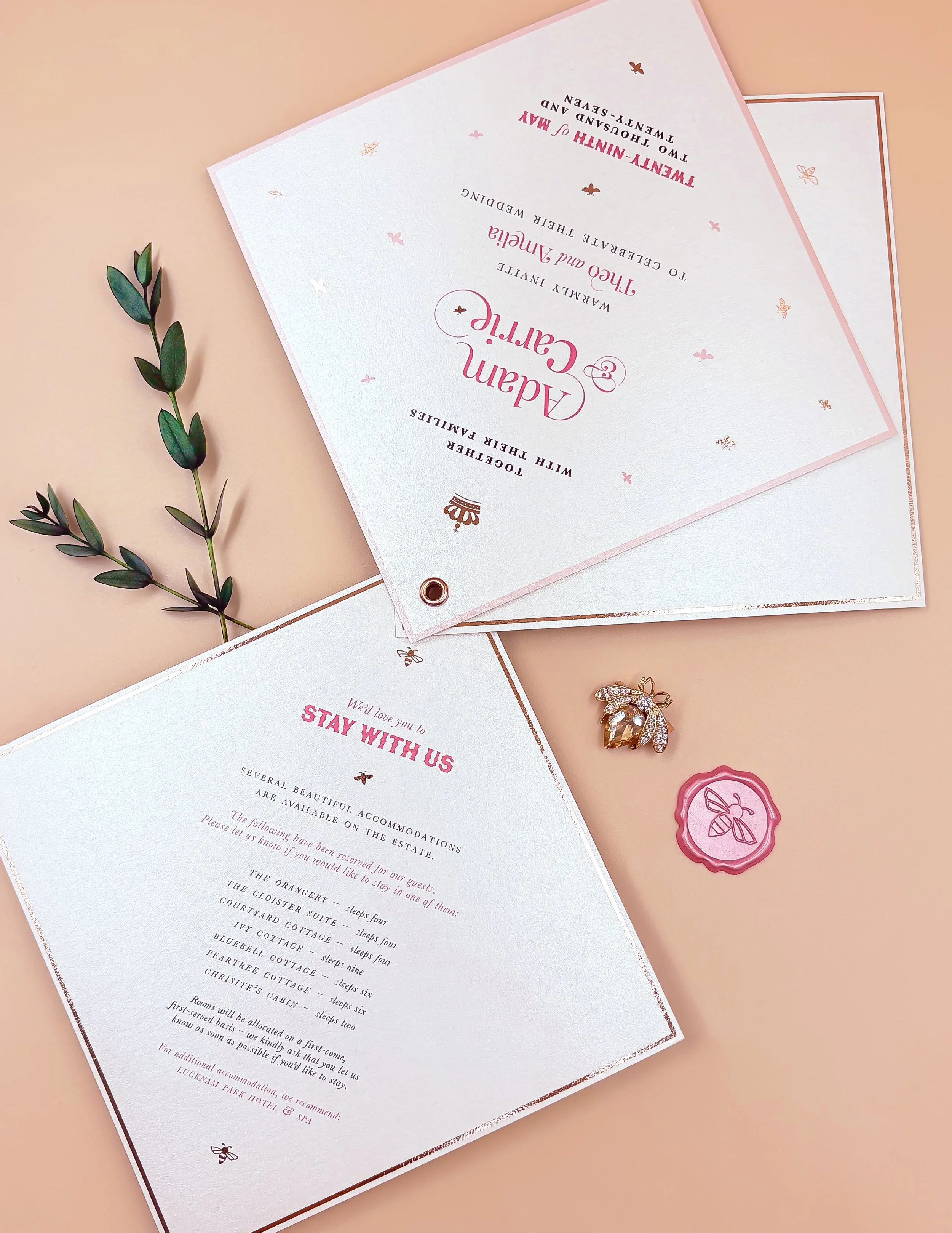
Created for couples drawn to elegant storytelling and soft editorial flair, Sweet Like Honey is a celebration of charm, craftsmanship, and quiet luxury. The suite was designed with Euridge Manor in mind – a Cotswolds dreamscape where ivy-covered walls, weathered stone, and golden light create a warm, organic backdrop. But it could just as easily belong to a Provençal estate or an Italian olive grove.
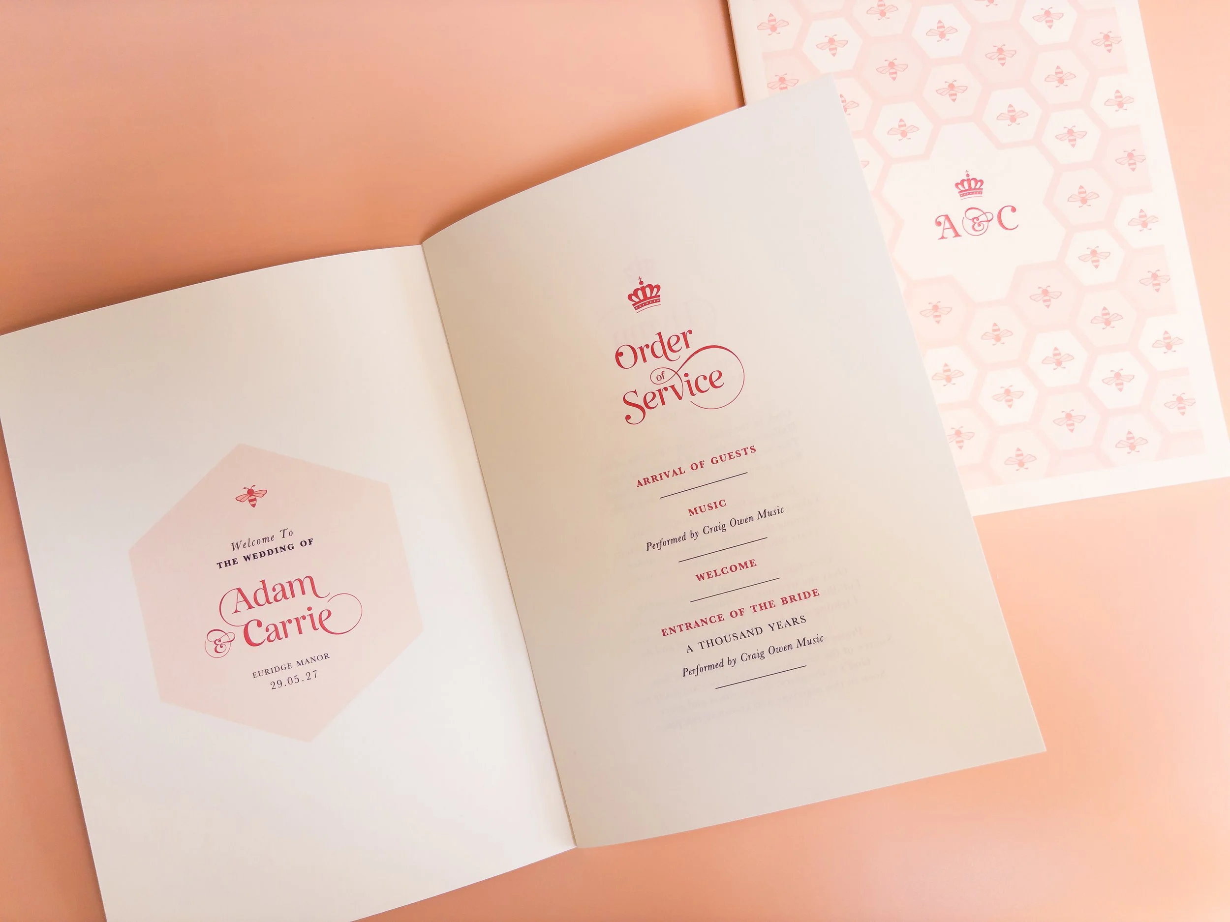
The brand feeling is timeless: natural beauty with a tailored edge. The styling is heavily inspired by couture fashion houses, with a palette of ivory, rose-gold and soft blush, combining elegant typography alongside a signature honeycomb print.

how the wedding brand comes to life
The Hallmark Elements:
✧ A Cohesive Palette
A warm blend of blush, soft honey, and creamy neutrals. Chosen not to shout, but to glow. The palette works across every item, from invitations to table menus, creating gentle consistency without ever feeling matchy.
✧ signature motif
The honeycomb pattern is subtle yet distinctive. Each hexagon features alternating mini bees with the couple’s monogram at its centre. It acts as a visual signature – used sparingly but with purpose, appearing on liners, wallets, and signage to create recognition and rhythm.
✧ elegant typography
A refined serif paired with gentle italic script. The balance of structure and softness makes it feel effortlessly stylish. Just enough romance, never overly ornate.
✧ considered materials
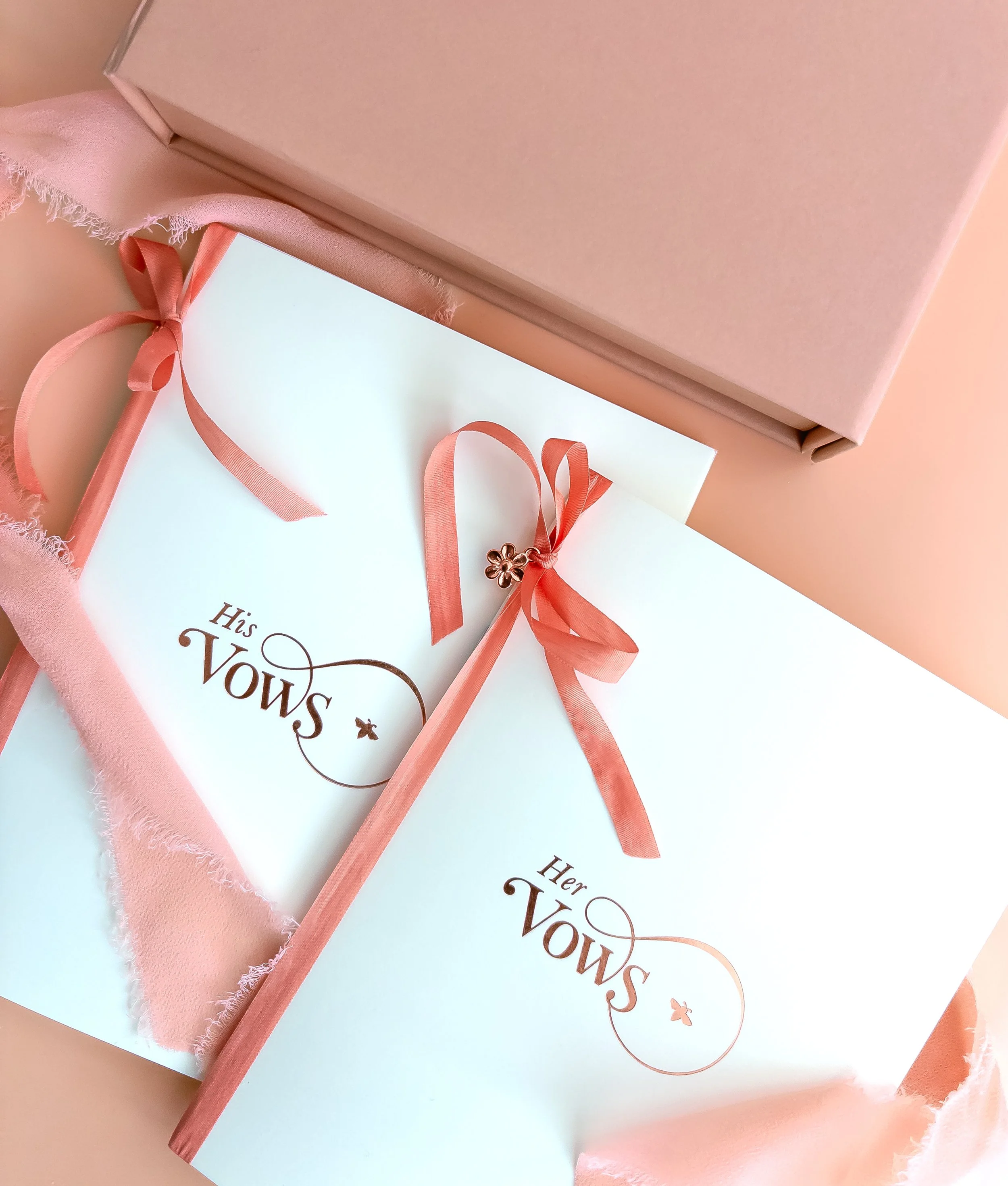
Luxury card stocks create contrast and layering, with soft matte and pearlescent finishes. Delicate rose-gold foil accents catch the light without overwhelming. Every material choice is intentional. Tactile, thoughtful, true to the brand.


beyond the invitation
The Sweet Like Honey wedding brand doesn’t stop at the invitation. It lingers through every detail:
Arch-cut welcome signage echoes the suite’s elegant design and layout, framed with the signature honeycomb motif and classic typographic styling for a soft yet striking impression.
Personalised menus continue the story with tall, slim proportions and matching rose-gold foil. Hand-styled with coordinating ribbon to sit beautifully on your tablescape.
Custom envelope liners are printed with either the couple’s monogram or the honeycomb pattern, revealing a glimpse of the suite’s identity from the very first moment.
Delicate wax seals and silk ribbon ties act as tiny couture touches, creating thoughtful, decorative signatures that complete the experience.
Each element feels purposeful and connected. A thread of beauty woven quietly through the day.


why it works
Sweet Like Honey isn’t just a stationery suite. It’s a full visual identity. A wedding brand in the truest sense. And the best part? It doesn’t overwhelm. It supports your day, gently elevating it with intention and elegance.
Whether you choose this collection for your wedding, or use it as a starting point to inspire something entirely bespoke, it shows what’s possible when every detail is designed to belong.

want to see the finer details?
Order your Sample Edit to experience Sweet Like Honey up close.
Beautifully packaged and ready to inspire your own signature look.